How to Get Good Images Out of Nano Banana 2 With a JSON Prompt
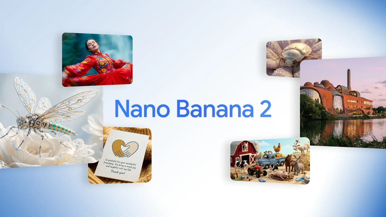
Nano Banana 2 is Google's Gemini 3.1 Flash Image model, announced on 26 February 2026. It is very good. Most people still get mediocre images out of it, and the reason is almost never the model.
Type "a woman in a cafe, cinematic lighting" and you will get a decent image. Type it again and you will get a different decent image. Neither is the one in your head, and you have no way to move from one to the other, because you never told the model what you actually wanted. You gave it eight words and it filled in the other two hundred decisions itself.
The fix is to make those decisions yourself, in a format you can save, diff, and reuse. A JSON prompt is the most practical way to do that.
Why JSON works, and what it is not
Worth being precise here, because there is a lot of nonsense written about this.
JSON is not a secret API. Nano Banana 2 does not parse your braces and map fields to internal parameters. Google's own prompting guide says the opposite of what you would expect: "A simple list of keywords won't cut it; you need to describe the scene narratively."
JSON works anyway, for two reasons. Nano Banana 2 is built on a Gemini reasoning model rather than a diffusion model, so it reads structured text the way it reads anything else, and the values inside your JSON are still narrative descriptions. "quality": "hard light with defined shadow edges" is a phrase, not a keyword. You are not replacing description with structure. You are hanging descriptions on a frame.
The second reason is the important one. The schema is a checklist. Nobody writing free-form prose remembers to specify the shadow density, the wall's sheen level, whether the subject's hair has flyaways, and what the left hand is doing. The schema asks you all of it. Filling it in is what makes the image specific, and the fact that it is JSON is what makes it reusable tomorrow.
So the value is completeness and reproducibility. Structure is the delivery mechanism, not the magic.
The schema
This is the full thing. Copy it. You will not write it from scratch by hand, and the next section explains how to fill it in without doing that.
{
  "metadata": {
    "confidence_score": "high/medium/low - assessment of analysis accuracy",
    "image_type": "photograph/digital art/illustration/graphic design/mixed media",
    "primary_purpose": "marketing/editorial/social media/product/portrait/landscape/abstract"
  },
  "composition": {
    "rule_applied": "rule of thirds/golden ratio/center composition/symmetry/asymmetry",
    "aspect_ratio": "width:height ratio or format description",
    "layout": "grid/single subject/multi-element/layered",
    "focal_points": [
      "Primary focal point location and element",
      "Secondary focal point if present"
    ],
    "visual_hierarchy": "Description of how eye moves through the image",
    "balance": "symmetric/asymmetric/radial - with description"
  },
  "color_profile": {
    "dominant_colors": [
      {
        "color": "Specific color name",
        "hex": "#000000",
        "percentage": "approximate percentage of image",
        "role": "background/accent/primary subject"
      }
    ],
    "color_palette": "complementary/analogous/triadic/monochromatic/split-complementary",
    "temperature": "warm/cool/neutral - overall feeling",
    "saturation": "highly saturated/moderate/desaturated/black and white",
    "contrast": "high contrast/medium contrast/low contrast/soft"
  },
  "lighting": {
    "type": "natural window/artificial/mixed/studio/practical lights",
    "source_count": "single source/multiple sources - number and placement",
    "direction": "front/45-degree side/90-degree side/back/top/bottom/diffused from above",
    "directionality": "highly directional/moderately directional/diffused/omni-directional",
    "quality": "hard light/soft light/dramatic/even/gradient/sculpted",
    "intensity": "bright/moderate/low/moody/high-key/low-key",
    "contrast_ratio": "high contrast (dramatic shadows)/medium contrast/low contrast (flat)",
    "mood": "cheerful/dramatic/mysterious/calm/energetic/professional/casual",
    "shadows": {
      "type": "harsh defined edges/soft gradual edges/minimal/dramatic/absent",
      "density": "deep black/gray/transparent/faint",
      "placement": "under subject/on wall/from objects/cast patterns",
      "length": "short/medium/long - shadow projection distance"
    },
    "highlights": {
      "treatment": "blown out/preserved/subtle/dramatic/specular",
      "placement": "on face/hair/clothing/background - where light hits strongest"
    },
    "ambient_fill": "present/absent - secondary fill light reducing shadows",
    "light_temperature": "warm (golden)/neutral/cool (blue) - color cast"
  },
  "technical_specs": {
    "medium": "digital photography/3D render/digital painting/vector/photo manipulation/mixed",
    "style": "realistic/hyperrealistic/stylized/minimalist/maximalist/abstract/surreal",
    "texture": "smooth/grainy/sharp/soft/painterly/glossy/matte",
    "sharpness": "tack sharp/slightly soft/deliberately soft/bokeh effect",
    "grain": "none/film grain/digital noise/intentional grain - level",
    "depth_of_field": "shallow/medium/deep - with subject isolation description",
    "perspective": "straight on/low angle/high angle/dutch angle/isometric/one-point/two-point"
  },
  "artistic_elements": {
    "genre": "portrait/landscape/abstract/conceptual/commercial/editorial/street/fine art",
    "influences": [
      "Identified artistic movement, photographer, or style influence"
    ],
    "mood": "energetic/calm/dramatic/playful/sophisticated/raw/polished",
    "atmosphere": "Description of overall feeling and emotional impact",
    "visual_style": "clean/cluttered/minimal/busy/organic/geometric/fluid/structured"
  },
  "typography": {
    "present": true,
    "fonts": [
      {
        "type": "sans-serif/serif/script/display/handwritten",
        "weight": "thin/light/regular/medium/bold/black",
        "characteristics": "modern/vintage/playful/serious/technical"
      }
    ],
    "placement": "overlay/integrated/border/corner - with strategic description",
    "integration": "subtle/prominent/dominant/background"
  },
  "subject_analysis": {
    "primary_subject": "Main subject description",
    "positioning": "center/left/right/top/bottom/rule of thirds placement",
    "scale": "close-up/medium/full/environmental/macro",
    "interaction": "isolated/interacting with environment/multiple subjects",
    "facial_expression": {
      "mouth": "closed smile/open smile/slight smile/neutral/serious/pursed - exact mouth position",
      "smile_intensity": "no smile/subtle/moderate/broad/wide - degree of smile",
      "eyes": "direct gaze/looking away/squinting/wide/relaxed/intense - eye expression",
      "eyebrows": "raised/neutral/furrowed/relaxed - brow position",
      "overall_emotion": "happy/content/serious/playful/confident/approachable/guarded/warm/cold",
      "authenticity": "genuine/posed/candid/formal/natural"
    },
    "hair": {
      "length": "pixie/short/chin-length/shoulder-length/mid-back/long/very long - specific measurement",
      "cut": "blunt/layered/shaggy/undercut/fade/tapered/disconnected - exact style name",
      "texture": "straight/wavy/curly/coily/kinky - natural pattern with specific wave type (loose waves/tight curls/s-waves)",
      "texture_quality": "smooth/coarse/fine/thick/thin - hair strand thickness",
      "natural_imperfections": "flyaways/frizz/uneven sections/growth patterns/cowlicks - observable natural variation",
      "styling": "sleek/tousled/wet look/blow-dried/natural/product-heavy/messy/textured - exact current state",
      "styling_detail": "Degree of styling: heavily styled/lightly styled/unstyled, product visibility, movement quality",
      "part": "center/side/deep side/no part/zigzag - exact location with precision",
      "volume": "flat/moderate volume/voluminous - root lift and overall fullness",
      "details": "Specific features: bangs type, face-framing layers, buzzed sections, faded areas, length variations, texture inconsistencies"
    },
    "hands_and_gestures": {
      "left_hand": "Exact position and gesture - touching face/holding object/resting on surface/in pocket/behind back/clasped/visible or not visible",
      "right_hand": "Exact position and gesture - touching face/holding object/resting on surface/in pocket/behind back/clasped/visible or not visible",
      "finger_positions": "Specific details: pointing/peace sign/thumbs up/relaxed/gripping/spread/interlaced/curled",
      "finger_interlacing": "if hands clasped: natural loose interlacing/tight formal interlacing/fingers overlapping/thumbs position",
      "hand_tension": "relaxed/tense/natural/posed/rigid - muscle tension observable",
      "interaction": "What hands are doing: holding phone/touching hair/on hip/crossed/clasped at waist/clasped at chest/gesturing",
      "naturalness": "organic casual gesture/deliberately posed/caught mid-motion/static formal pose"
    },
    "body_positioning": {
      "posture": "standing/sitting/leaning/lying - exact position",
      "angle": "facing camera/45 degree turn/profile/back to camera",
      "weight_distribution": "leaning left/right/centered/shifted",
      "shoulders": "level/tilted/rotated/hunched/back"
    }
  },
  "background": {
    "setting_type": "indoor/outdoor/studio/natural environment - specific location",
    "spatial_depth": "shallow/medium/deep - layers description",
    "elements_detailed": [
      {
        "item": "Specific object name (if plant: species like monstera/pothos/bird of paradise/fern)",
        "position": "left/right/center/top/bottom - exact placement with quadrant",
        "distance": "foreground/midground/background",
        "size": "dominant/medium/small - relative scale and proportion",
        "condition": "new/worn/vintage/pristine/wilted/thriving - state description",
        "specific_features": "For plants: flower color, leaf pattern, pot type; For objects: brand, wear, details"
      }
    ],
    "wall_surface": {
      "material": "painted drywall/concrete/brick/wood paneling/tile/wallpaper/plaster - exact base material",
      "surface_treatment": "smooth paint/textured paint/raw concrete/polished concrete/exposed brick/finished/unfinished",
      "texture": "perfectly smooth/slightly textured/rough/patterned/brushed - tactile quality",
      "finish": "matte/satin/glossy/flat - sheen level",
      "color": "Specific color with undertones (e.g., warm gray, cool blue-gray, off-white)",
      "color_variation": "uniform/gradient/patchy/streaked - color consistency",
      "features": "clean/water stains/vertical streaks/horizontal marks/cracks/patches/fixtures/artwork/scuffs - ALL observable surface details",
      "wear_indicators": "pristine/aged/weathered/industrial/residential - condition and style"
    },
    "floor_surface": {
      "material": "wood/tile/carpet/concrete/grass - exact type",
      "color": "Specific color",
      "pattern": "solid/checkered/striped/herringbone - if present"
    },
    "objects_catalog": "List every visible object with position: furniture pieces, decorative items, functional objects, natural elements",
    "background_treatment": "blurred/sharp/minimal/detailed/gradient/textured"
  },
  "generation_parameters": {
    "prompts": [
      "Detailed technical prompt for recreating this style",
      "Alternative angle or variation prompt"
    ],
    "keywords": [
      "keyword1",
      "keyword2",
      "keyword3",
      "keyword4",
      "keyword5"
    ],
    "technical_settings": "Recommended camera/render settings description for recreation",
    "post_processing": "Color grading, filters, or editing techniques applied"
  }
}
Two notes before you use it. metadata and generation_parameters are notes to yourself and to whatever model helps you fill this in. They do not change the image much. Keep them, because they make the file readable six months later, but do not spend effort on them.
And you do not fill this in by hand. You get a model to do it.
Path A: build the JSON from a reference image
This is the highest-value use of the schema, and the one most people skip. You find an image whose look you want, and you have a model read it back into the schema. What you get is not a copy of that image. It is a description of its treatment, which you can then point at a completely different subject.
Open Claude or Gemini, attach the reference image, paste the schema, and use this:
Analyse the attached image and fill in every field of the JSON schema below. Replace each placeholder with what you actually observe, not with the placeholder options. Be specific: name the exact colour with undertones, the exact shadow density, the exact hair texture, every mark on the wall. Where a field does not apply, write "not applicable" rather than deleting the field. Do not add fields. Return only the JSON.
[paste schema here]
The output is a portrait of the reference image's lighting, palette, surfaces, and grain. Now change one thing. Swap subject_analysis.primary_subject for your subject, leave everything else untouched, and generate. You get your subject in that image's world.
That is the trick. Style transfer through description rather than through a reference image, which means you can apply it to a hundred different subjects without re-uploading anything.
Path B: build the JSON from a vague idea
The other direction. You have a sentence and no reference. Give a model the schema as context and let it make the two hundred decisions, so that at least they are made and written down.
Here is a JSON schema I use to specify images for Nano Banana 2. Fill it in completely for this brief: "a tired chef taking a break in the alley behind their restaurant at night".
Make concrete choices for every field. Do not hedge and do not return placeholder options. Choose specific colours with hex values, a specific lighting setup, specific background objects with species and brands where relevant, and specific natural imperfections in hair, skin and surfaces. Aim for something that reads as a real photograph taken by a person, not a stock image. Return only the JSON.
[paste schema here]
Then read what it wrote and change the five things you disagree with. This is far faster than writing the whole file, and it is far better than the eight-word prompt, because the parts you did not care about are still specified rather than left to chance.
You can also keep a filled-in JSON you already like and ask for a variation: "here is my JSON, keep the lighting and background blocks exactly as they are and change the subject to X". Because it is structured, the model can do a targeted edit instead of rewriting everything.
The fields that actually change the image
Not all of the schema pulls equal weight. If you are going to spend attention somewhere, spend it here.
lighting, all of it. This is the single biggest lever, and it is the reason the schema breaks lighting into ten sub-fields. Direction, quality, shadow density, shadow length, highlight treatment, and fill are what separate a photograph from a render. "Soft light" is nothing. "Single large window at 45 degrees camera left, soft light, shadows with soft gradual edges and gray density falling to the right of the subject, no fill, highlights preserved on the cheekbone" is a lighting setup.
The imperfection fields. hair.natural_imperfections, wall_surface.features, wall_surface.color_variation, technical_specs.grain, and the condition on every background object. These exist for one reason: image models trend toward clean by default, and clean is what makes an image read as AI. Flyaways, a scuff below the light switch, a slightly patchy paint job, faint film grain. Ask for those explicitly or you will not get them.
hands_and_gestures. Hands are still where generated images fall apart, and the reason is usually that nobody said what the hands were doing. A hand with an assigned job goes wrong less often than a hand left to the model's imagination. If they are not in shot, say "not visible" and save yourself the trouble.
background.elements_detailed. Name the species of the plant. Name the material of the pot. "A plant in the corner" gets you the generic AI plant, the one you have seen a thousand times. "A mature monstera deliciosa with two split leaves, in a matte terracotta pot, back left quadrant, midground, slightly dusty" gets you a plant.
technical_specs.perspective and composition. Cheap to set, and they determine whether the image looks composed or centred by default.
If the full schema is more than you want to maintain, the useful minimum is composition, lighting, technical_specs, subject_analysis.primary_subject, and background. That is maybe a quarter of the file and most of the benefit.
Running it
Nano Banana 2 is not free, and the paid providers are the practical route. All three below are pay per image with no subscription.
| Provider | Model | Notes |
|---|---|---|
| fal | fal-ai/nano-banana-2 and fal-ai/nano-banana-2/edit |
Fastest to get running, good playground, separate endpoint for editing |
| Replicate | google/nano-banana-2 |
One endpoint for generate and edit, clean schema, easy to script |
| Gemini API | gemini-3.1-flash-image |
Direct from Google, cheapest per image, batch mode halves it again |
Pricing as published in August 2026: fal charges about $0.08 per image at the base resolution, with 0.75x for 512px, 1.5x for 2K and 2x for 4K, plus $0.015 if you enable web search. Google's direct API runs roughly $0.045 per image at 512px up to about $0.151 at 4K, with a 50 percent discount through the Batch API. Replicate publishes its per-image rate on the model page. Check current numbers before you build a budget on them.
There are also two smaller siblings worth knowing about. gemini-3.1-flash-lite-image is Nano Banana 2 Lite, cheaper and 1K only, which is the right choice for high volume where 4K is wasted. gemini-3-pro-image is Nano Banana Pro, slower and more expensive, worth it for dense text rendering and complicated multi-element compositions.
Replicate
import json
import replicate

with open("scene.json") as f:
    spec = json.load(f)

output = replicate.run(
    "google/nano-banana-2",
    input={
        "prompt": json.dumps(spec),
        "aspect_ratio": "9:16",
        "resolution": "2K",
        "output_format": "png",
    },
)
Replicate accepts 1:1, 2:3, 3:2, 3:4, 4:3, 4:5, 5:4, 9:16, 16:9, 21:9, 1:4, 4:1, 1:8, 8:1, and match_input_image for aspect ratio, and 512px, 1K, 2K or 4K for resolution. Pass reference images through image_input, which takes up to 14 of them.
fal
import json
import fal_client

with open("scene.json") as f:
    spec = json.load(f)

result = fal_client.subscribe(
    "fal-ai/nano-banana-2",
    arguments={
        "prompt": json.dumps(spec),
        "aspect_ratio": "9:16",
        "num_images": 1,
    },
)
Use fal-ai/nano-banana-2/edit when you are modifying an existing image rather than generating one. Parameter names on both platforms are as published on their model pages in August 2026, so glance at the schema tab if something is rejected.
The one gotcha
composition.aspect_ratio inside your JSON does not set the output dimensions. The API parameter does. Set both, keep them in agreement, and remember that if they disagree the API parameter wins and your JSON is just describing a shape the image does not have. Same applies to resolution.
For Shorts and Reels you want 9:16. For thumbnails, 16:9.
Iterating without starting over
Once the JSON exists, improvement stops being a rewrite and becomes an edit.
Change one block at a time. If the image is too clean, edit the imperfection fields and nothing else. If the mood is wrong, edit lighting and nothing else. Because everything else is pinned, you learn what that block actually does instead of shuffling the whole prompt and hoping.
Keep the versions. scene-v3.json next to scene-v4.json and a diff between them is a real record of what changed. You cannot do that with a paragraph you retyped.
Use conversational editing for small fixes. Google recommends refining with follow-up instructions rather than regenerating, and it works well. Get the JSON close, then say "make the shadow under the left hand softer" as a follow-up. Do not rebuild the whole file for a shadow.
Use positive phrasing. "Empty street" beats "no cars". This holds inside JSON values exactly as it does in prose, because the values are still sentences.
Where this really pays off: consistency
One good image is nice. The reason to do any of this is the second, tenth, and fiftieth image.
Split the schema into two halves. The frozen half is lighting, color_profile, technical_specs, artistic_elements, and any character description in subject_analysis you want repeated. The varying half is composition, background, and the subject's action. Freeze the first, change the second, and you get a set of images that plainly belong together.
That is how you get a channel with a look instead of a channel with fifty unrelated images. It is the same logic behind a recurring character, which we wrote about in the Bernard Films breakdown: on a platform where nobody sees your channel page, recognition has to happen inside the frame, and it has to happen in under a second.
If you would rather not do this per image
Everything above is worth doing when you are producing images one at a time and you care about each one. It does not scale to a channel posting three times a week, where a single video needs a dozen images and you need them to match each other and the ones from last week.
That is the problem PassiveShorts handles. You pick a visual style, write a custom prompt describing the look and any recurring character, and every image in every video of that series is generated against it. The consistency logic is the same as the frozen-half idea above. You just are not the one maintaining the file.
If you are hand-crafting hero images, thumbnails, or a brand's key art, build the JSON. If you are running a series, set the style once and let it run.
Related reading
- Bernard Films: 31 Videos, 174 Million Views, Six Months, on why a consistent look beats a consistent topic
- How to Automate YouTube Shorts, on the mechanics of keeping a series posting
- 12 Faceless YouTube Channel Ideas That Still Have Room in 2026, on picking the ground before you build the format